
Understanding variation in data is fundamental to making informed decisions in quality control, manufacturing, business, and research. Variation shows how much data points differ from one another — revealing consistency, trends, and outliers. Several tools help visualize and quantify variation effectively. Let’s explore the five most common ones: the stem-and-leaf plot, histogram, numerical summary, box plot, and probability distributions.
1) The Stem-and-Leaf Plot
A stem-and-leaf plot displays data in a way that preserves the actual numbers. It organizes data into “stems” (the first digits) and “leaves” (the last digit) to show distribution patterns.
Example:
Test scores: 72, 85, 91, 66, 75, 88, 84, 93, 79, 81
| Stem | Leaf |
|---|---|
| 6 | 6 |
| 7 | 2 5 9 |
| 8 | 1 4 5 8 |
| 9 | 1 3 |
Here, you can see most scores fall between 70–90, indicating moderate variation with a slightly higher performance trend.
Why it matters:
Stem-and-leaf plots show the spread and shape of data while keeping all original values visible — perfect for small data sets.
2) The Histogram
A histogram is a bar graph that groups data into intervals (called bins) and displays the frequency of values within each range. It’s useful for identifying patterns such as skewness, symmetry, and variation.
Example:
If we use the same test scores grouped into intervals:
- 60–69: 1
- 70–79: 3
- 80–89: 4
- 90–99: 2
Plotting these gives a histogram that shows most students scored between 80 and 89.
Interpretation:
The histogram clearly visualizes data distribution. A wide spread indicates high variation, while a narrow shape means low variation.
Why it matters:
Histograms are ideal for larger datasets and help identify patterns that might not be obvious from tables.
3) Numerical Summary of Data
While visual tools are helpful, numerical summaries provide exact measures of variation. Common summary statistics include:
- Mean (Average): Central tendency
- Median: Middle value
- Range: Difference between highest and lowest values
- Variance and Standard Deviation: Measure how much data varies from the mean
Example:
Using the same data: 66, 72, 75, 79, 81, 84, 85, 88, 91, 93
- Mean = (66 + 72 + 75 + 79 + 81 + 84 + 85 + 88 + 91 + 93) / 10 = 81.4
- Range = 93 – 66 = 27
- Standard Deviation ≈ 8.2
Interpretation:
A standard deviation of 8.2 means that most scores are within 8 points of the average score (81.4).
Why it matters:
Numerical summaries give a precise understanding of data variation, essential for decision-making and quality control.
4) The Box Plot
A box plot (or box-and-whisker plot) shows the five-number summary of data: minimum, first quartile (Q1), median (Q2), third quartile (Q3), and maximum. It effectively highlights the spread, skewness, and outliers.
Example:
For the same test scores:
| Statistic | Value |
|---|---|
| Minimum | 66 |
| Q1 | 75 |
| Median | 82.5 |
| Q3 | 88 |
| Maximum | 93 |
The box spans from Q1 (75) to Q3 (88), with a median at 82.5.
Whiskers extend to 66 and 93.
Interpretation:
Most students scored between 75 and 88. The data shows moderate variation with no extreme outliers.
Why it matters:
Box plots are perfect for comparing multiple datasets, especially in manufacturing or quality monitoring where variation between batches is analyzed.
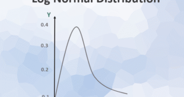
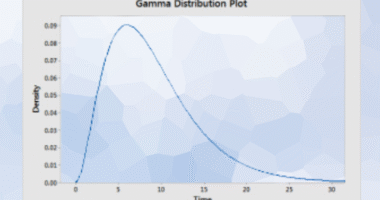
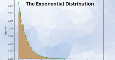
5) Probability Distributions
A probability distribution describes how likely each outcome is within a data set. It helps predict future results based on patterns in variation.
Common distributions include:
- Normal Distribution: Bell-shaped, most data near the mean
- Uniform Distribution: Equal probability across all values
- Binomial Distribution: For success/failure events (e.g., pass/fail)
Example:
In a normal distribution of test scores:
- Mean = 80
- Standard Deviation = 10
About 68% of students score between 70 and 90 (mean ± 1 SD).
Interpretation:
The probability distribution gives insight into how data behaves — helping forecast outcomes and assess process stability.
Why it matters:
Understanding probability distributions is vital for statistical process control, risk analysis, and forecasting.
Conclusion
Describing variation is a cornerstone of data analysis. Tools like the stem-and-leaf plot and histogram visualize data patterns, while the numerical summary and box plot quantify variation and identify outliers. Probability distributions extend this understanding to predict future outcomes.
Together, these tools offer a complete picture of how data behaves, empowering businesses, engineers, and analysts to make data-driven decisions with confidence.